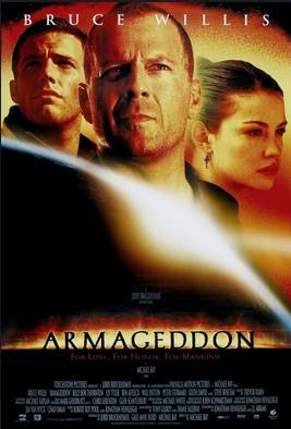
Movie posters attract the audience's attention, shape their expectations about what the movie will be like, and hopefully leave them excited to see it. They contribute to our overall movie-going experience, for better or worse. Although their role is small, it is there, so they had better look good if we want the most enjoyable experience from the movies.
Today's posters couldn't look more dull if they tried (and they appear to). Typically the main characters are shown in some pose with some expression on their faces, while divorced from any kind of action or interaction that would tell us what the plot is all about. It's like they're trying to sell these characters to children who were shopping for action figures, or to teenagers browsing through profile pictures to see who they might want to be friends with.
Even pure character studies need some kind of plot structure to motivate the behaviors that reveal their character. Contemporary posters that lack context just come off as a group of dull head-shots that tell us nothing and therefore fail to lure us into the story. All we know is what kind of people we're going to be tagging along with — whatever they're up to, wherever they're going, for whatever purpose.
Since we'll be looking at science-fiction movies, here's a 21st-century example from Armageddon, although rom-coms and Oscar bait don't look too different.
Interstellar, the upcoming Christopher Nolan movie, has some posters cast from this mold, but I was surprised to also see this one, with something beyond mere head shots:
This looks pleasantly familiar. Brilliant rays of light reaching planet Earth far from off in outer space, in the dead of night to heighten the bright-dark contrast, and with the humble world down below unprepared for its imminent encounter with the Sublime. These elements formed the framework for just about every movie poster from the '80s that involved space travel and interaction between us and the outsiders. Have a look:
The lack of a celebrity headshot orientation allowed audiences to enter the theaters with an open mind about who they were going to meet, having made the trip more out of curiosity about the story.
The chiaroscuro style adds instant mystery, since nighttime scenes tend to be, well, really dark, and we're left wondering what the source of this brilliant light is, and what function it serves — to try to communicate with us, to guide a ship, to announce their arrival? Or maybe it's the outcome of an intense natural phenomenon that we've never seen before, not having paid much attention to what goes on in outer space.
That's all we need — a little visual mystery to lure us into wanting to experience the story. Not visual obviousness — here are the main characters wearing kabuki masks just so you're clear on what they're all like (and don't bother asking what the story is about).
Though seemingly minor players in the overall movie experience, posters can leave strong impressions, so we ought to demand more from the studios when they release these expectation-shaping ads. You never know, sometimes a horrible movie can become memorable simply for its bitchin' poster:


No comments:
Post a Comment
You MUST enter a nickname with the "Name/URL" option if you're not signed in. We can't follow who is saying what if everyone is "Anonymous."