
Just like the dark-on-light scheme for computer screens, this looks a little too calming, soothing, and tranquilizing -- not how we ought to feel when trying to stir awake. People in today's Prozac nation must not feel like getting out of bed in the morning.
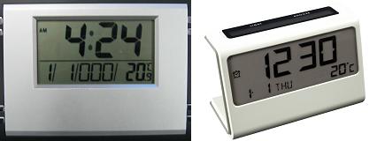
Plus you can't see it in the dark, i.e. when you need it most, before and after going to sleep for the night. They usually have a button that will temporarily light it up, but it only lasts five seconds and you must be nearby to activate it. I remember when you could tell time from across the room during the night and early morning, with no room lights on.
We need something more stimulating, like the bright text against black background that we saw on computer screens from the '80s. Vintage alarm clocks to the rescue. As with the old computer screens, notice again how futuristic and technological these old clocks look.

Nothing like a little neon in the morning to open your eyes up. Just enough of a jolt to get you out of bed. They come in the same range of colors that the old computer text came in -- red, amber, green, and blue.
Even the non-digital clocks with the flipping numbers had a white-on-black scheme, when they could just as easily have done black-on-white. Here are Marty McFly's clock from Back to the Future, and the one that kept waking up Phil Connors in Groundhog Day:

Alarm clocks from the '70s and '80s made it even easier to wake up ready for your day because they often came with a radio, and you could have your favorite station switch on instead of those annoying clanging and beeping sounds from before. Of course, that was back when the average pop song could put a little pep in your step. No point in waking up to Fergie or John Mayer -- might as well go back to sleep. Who knew that turning on the radio would become the same as hitting the snooze bar?
Product designers got ever more creative and ambitious during the '80s. Here by Soundesign is an alarm / clock / radio / cassette player / telephone:

Looks cooler than a Zen minimalist iPhone, without trying hard to whore for visual attention. It's got an interesting two-tone contrast, and a couple points of bright blue and orange, with red light from the clock. Neat and eye-catching without looking self-aware as a design object, like you'd find today at Target.
Dark-on-light computer screens are making us less productive than we could be, and dark-on-light alarm clocks don't exactly make our eyes feel energized first thing in the morning. When you need something more engaging and stimulating, it looks like light-on-dark is the winner yet again. It's nice to find this in a totally different domain of life from typing in front of a computer screen, since it shows how general the result appears to be.
Fortunately for those who want to change back to the more effective way of being woken up, mainstream retailers still stock the light-on-dark types. Walmart's website shows that of the top 20 best sellers for digital alarm clocks, half are dark-on-light and half are light-on-dark. People may have changed their use of computers from productivity to goofing around, shifting all color schemes to dark-on-light. But alarm clocks still need to wake you up in the morning, so the more stimulating light-on-dark kind is still easy to find.
I was unaware that light-background alarm clocks had become popular. My current one is light on dark, as was the clock-radio I've mentioned before.
ReplyDeleteToday at work there was a meeting to present what our UI is supposed to look like. It's light on dark, but some people complained there was too much black. I'm an API developer with no plans to use the UI, so I didn't have an opinion. I am annoyed at the functionality I have to implement because the consulting firm they've hired wants it to imitate some other popular programs. A coworker once accused the consultants of ripping off some upcoming videogame's website for the use of dark-background map in concept art, but apparently the ultimate source was some mode of viewing Google maps.
I'm all for brightly colored alarm clock digits in the morning but when I'm trying to fall asleep at night it is damn annoying. I would rather sleep in a room with dozens of loud ticking clocks than one with bright neon digits. I am so sensitive to light when trying to fall asleep that I even built a special container out of a shoebox to hold my modem (located in my bedroom) so the flickering lights would be hidden.
ReplyDelete