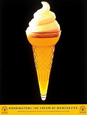
The pictures below are mostly from the 1980s, though there are a couple from the later '70s. Some are cheesier, others slicker. All show a basic level of sincerity and lack of pretentiousness that is refreshing and endearing in an age when self-awareness and affectation have made graphic design so flabby and flaccid. Like, it's just a car ad -- lighten up, dude!
Unlike works in a museum, these make up much of the visual fabric of our everyday lives. We don't expect something as sublime as what you'd find in a museum, but give us something! Glib dismissal of popular culture in practice leads to an even greater debasement of the culture overall, because it's not as though the snob has managed to substitute museum pieces for perfume ads. All he's done is clear the way for the dullification of what used to be a lively-looking style at the popular level.
And now on with the show... I tried to cover as wide of a range of sources as I could easily find. Obviously there's lots more, and this isn't attempting to be exhaustive. Still, it's fascinating how broadly the basic style was adopted. You could hardly look anywhere back in the '80s and not find it there, pleasantly calling your attention.
Miscellaneous
Car ads
Album covers
Movie posters
Perfume ads


How does the suicide rate fit into your schema?
ReplyDeleteIt doesn't correlate with the crime rate - for instance, I believe that the suicide rate rose from 1950-1980.
Maybe the suicide rate can be used to further subdivide social epochs. For instance, compare the high suicide 60s and 70s with the low suicide, carefree 80s.
-Curtis
I don't remember too much off the top of my head, but there was a lot of age heterogeneity. The teen suicide rate didn't look like the overall one, iirc.
ReplyDeleteMore outgoing people want their eyes to be engaged by contrasts
ReplyDeleteYeah, this seems supported :
http://www.ncbi.nlm.nih.gov/pubmed/1215134 - "Color preferences of 190 art students (Götz & Götz, 1974, 1975) were compared with the corresponding scores on extraversion (E) and neuroticism (N). It was found that the preferences of a group of 27 highly gifted young artists were different from preferences of average and less gifted Ss who had little or no artistic practice. In the latter group extraverts and ambiverts mainly preferred primary and secondary colors (light clear and dark clear tones included), while introverts preferred tertiary colors (earth colors) and achromatics. However, in the group of highly gifted Ss no significant differences between positive and negative rankings in both color categories were found. Neuroticism had no effect on color preferences; this holds for introverts and extraverts and for each single color."
http://www.tandfonline.com/doi/abs/10.1080/0091651X.1967.10120401#.UdXIGPnVDkw - "The findings were at variance with the above-mentioned claims in that nearly all the personality groups preferred “cool” colors to the “warm”, but there was a tendency for Introverts to prefer more “cool” colors and for Extraverts more “warm” colors."