
But aside from that, what I'm looking at here is what we find beautiful in works of art. There hasn't been as extensive of an investigation of this as there has been to determine what about a physical human body appeals to us, yet the available evidence suggests that symmetry is not very appealing in works of art. This has lead psychometricians of creativity -- and damn few they are! -- to devise the Barron-Welsh Scale of Art, which tests how well the individual likes or dislikes forms that are symmetrical vs asymmetrical, and simple vs complex. They've found that more creative individuals (presumably, the pool from which artists emerge) favor more asymmetrical and more complex drawings. Sidenote: this test is just a measurement instrument -- there is a theoretical background the creators have (mostly Freudian), but that is independent of its worth as a valid test. Similarly, you may believe that differences in intelligence are mostly caused by working memory differences, while someone else believes them to be caused by differences in sensory discrimination -- at the end of the day, both of you agree that IQ tests like the Wechsler are valid testing instruments.
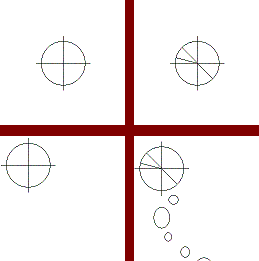
To demonstrate the surprising obviousness of what sounds counterintuitive, let me (a non-artist) draw a nice picture in which both the figure is symmetrical and its placing among the background is symmetrical. Pretty boring, eh? Notice how if I make the figure asymmetrical and maintain its position, or maintain the figure but move its position so that there's a "disturbance" of equilibrium, it looks a bit more interesting. It looks even cooler when I do both (I've made this fourth picture more "complex" as well, just to shorten expository space).
Now, I just improvised those doodles, so don't read too much into them. But there are also parallels from the history of art; for example, ancient sculpture. The Egyptian practice was to pose the bodies in rigid stance, such that they were symmetrical left-to-right when viewed from the front or back. This continued in ancient Greek sculpture, although at one point the kouroi were positioned so that one foot stood in front of the other -- creating at least a smidgen of asymmetry. In the ancient Greek or Roman sculpture you're used to seeing, though, the bodies are positioned in a contrapposto stance, where the weight is on one foot. These sculptures are no longer symmetrical (or even close) from any viewpoint, as the shoulder and hip axes are tilted, among other things. Despite the asymmetrical image they project onto our retinas, they appear more "natural" than the stiff Egyptian and early Greek statues that project more symmetrical images.
This preference for asymmetry could result from two other of Ramachandran's principles -- namely, the avoidance of coincidences and the joy of perceptual problem-solving. Human forms that would project symmetrical images on our retinas would have to be highly contrived, as if the person were ordered to pose bolt upright. The other explanation -- that we just happened to look at this person when they were posed in the highly unlikely symmetrical-favoring stance -- requires a big coincidence, so we opt for "they were made to stand that way," which calls too much attention to the work itself. It has much the same effect as if actors were to always position themselves symmetrically with respect to the audience or camera -- it would have a jarring effect. Great for the alienating toolbox of a Berthold Brecht, perhaps, but not for expressing beauty. Or, it could be that we enjoy the asymmetrical posture because we are interested in how symmetrical it might be if we just oriented it properly, but this requires us to mentally rotate the figure into a canonical "poster in a doctor's office" stance. Just as people get fun out of playing Tetris, so we might get a kick out of this mental rotation as a means of inspecting its "true" symmetry.
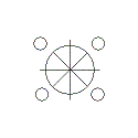
I favor a third, not mutually exclusive explanation: that asymmetry suggests movement, and as most moving figures we encountered throughout the course of our evolution were living things, a preference for asymmetry could be parasitic off of our interest in isolating biological things within our visual environment, similar to what our motion detectors are for. True, some inanimate things move, but aren't we more likely to anthropomorphize inanimate matter when it moves rather than when it remains still? (I just committed this error -- it should read: "when it is moved by some external force.") An angry avalanche of rocks hurtling toward their target. A bustling rapid with no free time to spare. Autumn leaves dancing in a rapturous wind. Whereas a mountain, a still pond, and a heap of leaves don't intuitively suggest signs of life (if anything, anthropomorphizing these latter would require us to use metaphors suggesting the ending or exhaustion of life or vital energy, such as a sulking mountain or a shallow grave of leaf-corpses). In fact, compare my fourth doodle to this one, which is just as complex but symmetrical. Which one looks like it's moving? And which like it's more likely a biological form?
 With contrapposto statues, asymmetry is probably favored due to Ramachandran's principles of coincidence avoidance and perceptual problem-solving, as the figures are at rest rather than moving. But take the well known Laocoon -- the complex asymmetry is probably favored here due to its suggestion of motion, in particular the desperate writhing of the main figure. Suggesting motion in a static sculpture like this also conveys the energy or force required to produce the motion, in this case that of the main figure as he struggles. Thus, asymmetry can be used to produce a sort of dramatic tension, as we undestand what forces cause this motion (character struggling), rather than the awkward tension produced by bolt upright statues, where the force is the artist's intervention due to lack of ability to portray the figures in a natural posture. (Though again, in the hands of an artist intent on disturbing the audience, these bolt upright postures could create a "wait, what's going on here?" uncanny atmosphere.)
Symmetry is preferred in architecture (Chartres Cathedral is close to being the exception that proves the rule), but not in golf course architecture. I think the difference is that people want their buildings looking unnatural and their golf courses natural, and macro-scale nature is very rarely symmetrical.
ReplyDelete